User feedbacks:
- Cumbersome manual processes impede workflow and evoke frustration.
- The outdated, non-user-friendly portal demands excessive mental and physical effort.
- Users face task incompletions, resulting in wasted time.
Back
Existing Lloyds Bank mobile app lacks user-friendly design, intuitive navigation, and essential features, leading to confusion, inefficient expense tracking, and frustrating savings process.

My Role
Product Designer
Duration
4 Weeks
Platform
iOS
Key Stakeholders
Professor Savraj Matharu
Michal Heichel
Jonathan Levi
overview
Lloyds Banking Group stands as one of the largest banks in the United Kingdom, with over 14 million individuals utilizing their mobile application for daily banking activities.
As part of the Interactive Media Practice at the University of Westminster, I was assigned this project by my university professor, with the objective of enhancing user engagement and implementing essential features.
Highlights

Target audiences
Millennials, Gen Z
Research summary
Market research insights
As I did comprehensive market research & competitive analysis, the insights proved invaluable for understanding the UK banking industry. These insights are crucial for Lloyds to develop a competitive mobile application aligned with customer needs and expectations.

User research insights
I read existing user reviews from app stores, ran an online survey, and conducted interviews with real users to understand the problems users are having.


Problem space
Objectives
Behavioural m.a.t.
When you want a user to perform a task, they need three things: sufficient motivation to undertake the task, a prompt or trigger, and the ability to complete it (which includes time, money, physical and mental ability).
I have used the BJ Fogg Model to map these elements of behavior that encourage or discourage our target users from performing mobile banking activities and making financial decisions. Based on this, I have designed a new interface that takes these aspects into consideration, in order to make the experience both engaging and intuitive for our users.
Key motivators

User friendly design
Ease of use
Personalisation
Transparency & feedbacks
Expense tracking
Incentives
Automated system
Ability
Limited time (Extremely busy)
Associated difficulty with the desired action

Financial solvency
Extra costs (Living, business, and others)
Spending habits
Financial & technical literacy
triggers/prompts
Changes in activities
Banking activity notifications
When they need to do a banking related task
Key questions
How can I encourage the younger generation to save more money?
How can I ensure efficient expence tracking and better money management within the app?
Information Architecture (IA)
To ensure a seamless user experience, I completely reorganised the overall Information Architecture (IA) of the application, aligning it with iOS guidelines and defining clear interaction patterns.

Visual design direction
Scalable design system
In pursuit of a seamless and consistent design process, I meticulously crafted a comprehensive design system for this project. This section provides a glimpse of its implementation.


Hi-fidelity Wireframes

Finalising the visual patterns
To make sure the consistency throughout the application I tried multiple visual patterns and finalised one.

Interaction planning for the application
1. Structural Navigation Pattern
To divide the hierarchy at the root level I used flat navigation pattern. Although existing Lloyds application has this navigation patter.

When there are internal navigations, I used drill-down navigation pattern (tree structure).


2. Overlay Navigation Pattern
When there are no internal navigations, I used overlay navigation pattern. It can be high friction, low friction, and non modal based on the contents.

Responsiveness
One of the crucial part of designing iOS application is to make sure the design is responsive across different screen sizes and design assets are perfectly exported for perfect implementation.

Solution 01
Before

User story
I want to be able to easily navigate throughout the app and access banking services, so I can efficiently manage my tasks and save time.
Final design
I redesigned the essential screens with a familiar interface resembling traditional online banking. Utilizing availability heuristic, I highlighted daily activities for user-centric performance. Additionally, I employed seamless navigation and interaction, ensuring users adapt effortlessly.
Easy access to important information.
Easy navigation throughout the app.

Solution 02
Before

User story
I want to set different saving goals, customise them as needed, and track my saving progress, so that I can have personalised control over my financial goals and be motivated to save more.
Final design
I have implemented a new feature called "Savings Pot" that enables users to create multiple saving goals based on their specific objectives and timelines.
They can add or withdraw money from these pots anytime. Additionally, to make the experience more engaging for users, I have gamified it by offering rewards.
Ensured personalized experience by offering customization.
User can track their savings progress that fosters sense of accomplishment.
Gamified the experience to encourage younger generation to save more.


Solution 03
Before

User story
I want an easy and efficient way to manage all my cards in one place, so that I can access and monitor my card details, transactions, and balances conveniently.
Final design
I have designed the dashboard by using the concept of minimalism. The available cards are displayed on the dashboard, along with quick access to key actions. In order to give users more control and autonomy over their financial transactions and card usage, I have included card controls. These controls allow users to freeze their card, manage their payment methods, and view their spending limits.
Reduced the cognitive load and interaction cost required to perceive card information.
Easy access to key informations.
Ensured transparency and control.

Solution 04
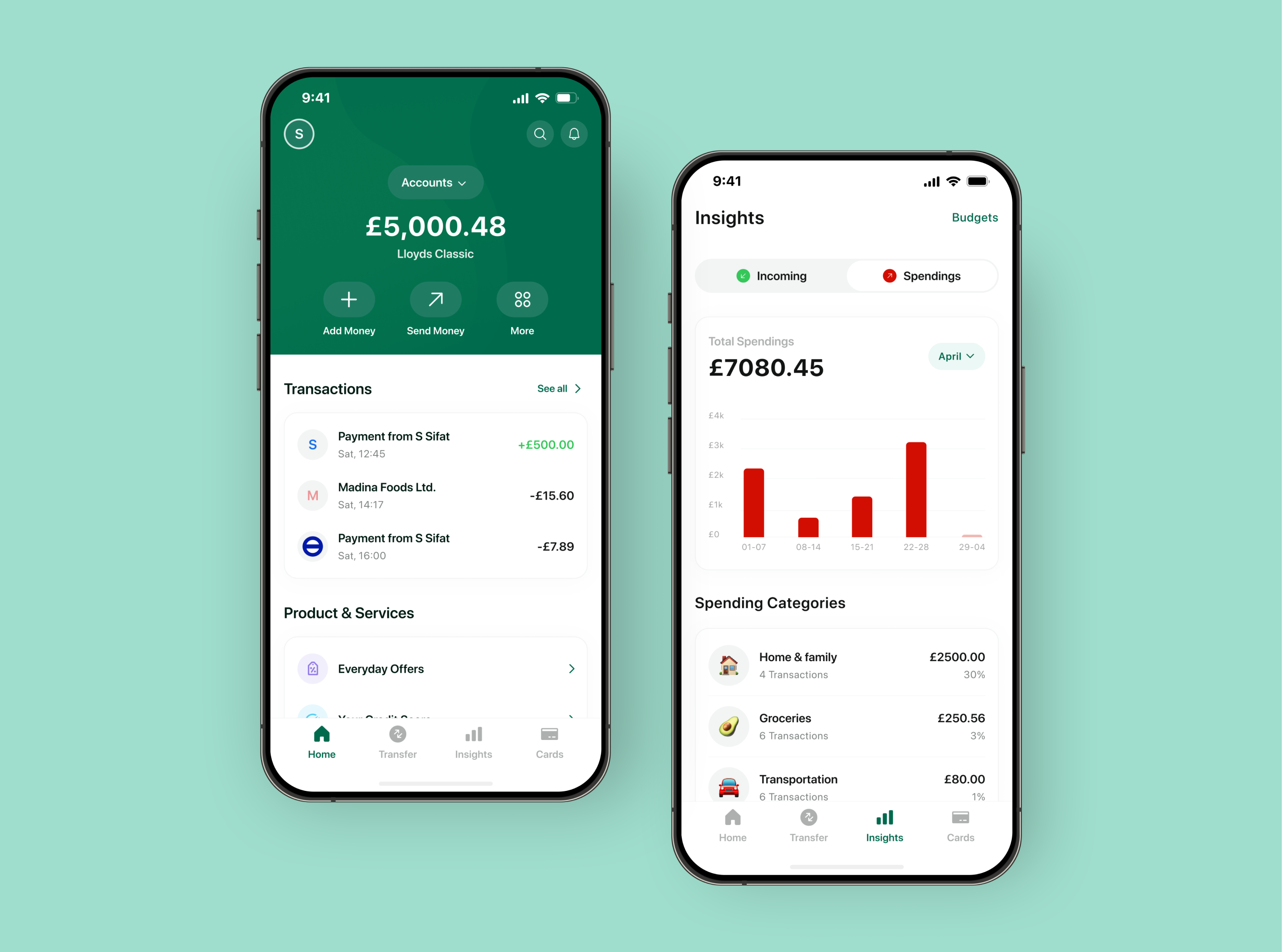
User story
I want to set monthly budgets for my regular spendings and like to have a clear visual representation of my banking activities so that I can track my expenses, manage my money well, easily understand my financial status,
and save money.
Final design
I have presented incomes and spendings in clear language along with easily understandable charts, which makes use of the availability heuristic to help users place high importance on available data.
To enable users to comprehend the spending insights more effectively, I have broken down the spending information into specific categories.
In line with the principle of mental accounting, I have allowed users to set flexible budgets into categories to help them mentally allocate their funds and track their spending in a more organized and purposeful manner.
Fostered responsible spending
Provided transparent banking insights
Ensured transparency and control.
Increased user engagement.

Design Achievements


.png)